CardView in Flutter : Making Stunning UIs in Minutes
Introduction to CardView in Flutter
CardView in Flutter enhances the visual appeal of your app. It adds a card-like interface with elevation and rounded corners. Using CardView in Flutter makes your app look polished and professional.
Setting Up Your Flutter Environment
First, ensure you have Flutter installed. Open your terminal and run:
flutter create cardview_exampleOpen your project in your preferred IDE. We will edit the main.dart file.
Creating Your First CardView in Flutter
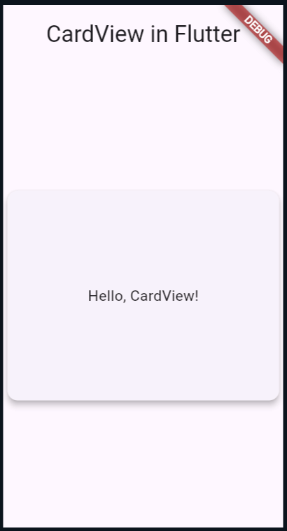
To create a CardView, we use the Card widget. Let’s start with a simple example:
import 'package:flutter/material.dart';

void main() {
  runApp(MyApp());
}

class MyApp extends StatelessWidget {
  @override
  Widget build(BuildContext context) {
    return MaterialApp(
      home: Scaffold(
        appBar: AppBar(
          title: const Text('CardView in Flutter'),
        ),
        body: Center(
          child: Card(
            elevation: 5,
            shape: RoundedRectangleBorder(
              borderRadius: BorderRadius.circular(10),
            ),
            child: Container(
              width: 300,
              height: 200,
              child: Center(
                child: const Text('Hello, CardView!'),
              ),
            ),
          ),
        ),
      ),
    );
  }
}
In this code, we created a simple CardView. The Card widget adds elevation and rounded corners to your content.
Customizing CardView
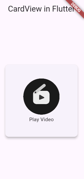
Next, we customize the CardView to enhance its look. We add images, icons, and text to create a more informative card.
Adding Images to CardView
To include an image, modify the child property of the Card widget:
              Image.network(
                  'https://cdn.pixabay.com/photo/2024/04/07/10/16/play-8681108_960_720.png',
                  width: 100,
                  height: 100,
                  fit: BoxFit.fill),

          ),
main.dart
import 'package:flutter/material.dart';

void main() {
  runApp(MyApp());
}

class MyApp extends StatelessWidget {
  @override
  Widget build(BuildContext context) {
    return MaterialApp(
      home: Scaffold(
        appBar: AppBar(
          title: const Text('CardView in Flutter'),
        ),
        body: Center(
          child: Card(
            elevation: 5,
            shape: RoundedRectangleBorder(
              borderRadius: BorderRadius.circular(10),
            ),
            child: Container(
              width: 200,
              height: 200,
              child: Center(
                  child: Column(
                      mainAxisAlignment: MainAxisAlignment.center,
                      children: [
                    Image.network(
                        'https://cdn.pixabay.com/photo/2024/04/07/10/16/play-8681108_960_720.png',
                        width: 100,
                        height: 100,
                        fit: BoxFit.fill),
                    SizedBox(height: 3),
                    const Text('Play Video'),
                  ])),
            ),
          ),
        ),
      ),
    );
  }
}
This code snippet adds an image and text to your CardView. Remember to use a valid image URL.
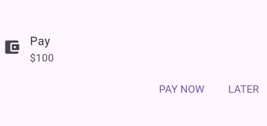
Incorporating Icons and Buttons
Icons and buttons add interactivity to your CardView. Here’s an example:
import 'package:flutter/material.dart';

void main() {
  runApp(MyApp());
}

class MyApp extends StatelessWidget {
  @override
  Widget build(BuildContext context) {
    return MaterialApp(
      home: Scaffold(
        appBar: AppBar(
          title: const Text('CardView'),
        ),
        body: Center(
          child:  Column(
  mainAxisSize: MainAxisSize.min,
  children: [
    ListTile(
      leading: Icon(Icons.account_balance_wallet),
      title: Text('Pay'),
      subtitle: Text('\$100'),
    ),
    ButtonBar(
      children: [
        TextButton(
          child: const Text('PAY NOW'),
          onPressed: () {/* ... */},
        ),
        TextButton(
          child: const Text('LATER'),
          onPressed: () {/* ... */},
        ),
      ],
    ),
  ],
),

        ),
      ),
    );
  }
}
This example uses ListTile and ButtonBar to add icons and buttons. These elements make your CardView interactive and informative.
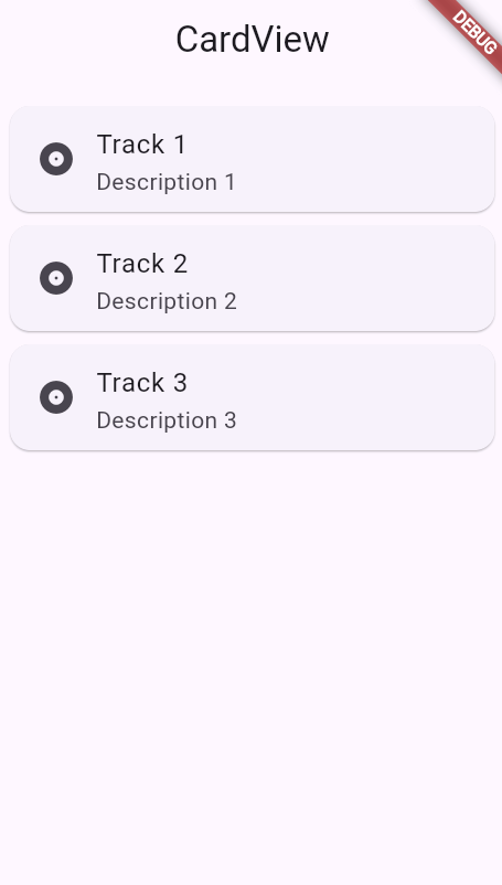
Advanced CardView in Flutter : Adding Multiple Cards
Creating multiple cards in a list is a common use case. Here’s how you can achieve that:
import 'package:flutter/material.dart';

void main() {
  runApp(MyApp());
}

class MyApp extends StatelessWidget {
  @override
  Widget build(BuildContext context) {
    return MaterialApp(
      home: Scaffold(
        appBar: AppBar(
          title: const Text('CardView'),
        ),
        body: ListView(
  padding: const EdgeInsets.all(8),
  children: <Widget>[
    Card(
      child: ListTile(
        leading: Icon(Icons.album),
        title: Text('Track 1'),
        subtitle: Text('Description 1'),
      ),
    ),
    Card(
      child: ListTile(
        leading: Icon(Icons.album),
        title: Text('Track 2'),
        subtitle: Text('Description 2'),
      ),
    ),
    Card(
      child: ListTile(
        leading: Icon(Icons.album),
        title: Text('Track 3'),
        subtitle: Text('Description 3'),
      ),
    ),
  ],
),
      ),
    );
  }
}
This code creates a list of cards with different content. Using ListView, you can scroll through the cards.
Key Advantages
Enhanced Visual Appeal: CardViews add elevation, shadows, and rounded corners, making your app’s UI look polished and professional.
Effortless Layout Integration: CardView seamlessly integrates with Flutter’s layout widgets, making it easy to create complex and responsive UI designs.
Creating a CardView in Flutter is simple and effective. It enhances your app’s UI by adding a professional touch. By customizing CardView, you can create engaging and interactive interfaces. Experiment with different properties and widgets to make your CardView unique. Happy coding with Flutter!