
Custom Widgets in Flutter : Card, Custom Text Field, and Button
Creating custom widgets in Flutter allows developers to build unique and reusable UI components tailored to their specific application needs. This guide will walk you through the process, providing practical examples to help you get started.
Why Create Custom Widgets?
Flutter’s rich set of pre-designed widgets caters to most UI needs, but custom widgets provide:
Reusability: Encapsulate UI logic for repeated use.
Flexibility: Achieve unique designs not possible with built-in widgets.
Maintainability: Simplify complex UI by breaking it into smaller components.
Custom widgets in Flutter come in two flavors: StatelessWidget and StatefulWidget.
StatelessWidget
A StatelessWidget is immutable and doesn’t change once built.
Example: Simple Custom Button
import 'package:flutter/material.dart';

class CustomButton extends StatelessWidget {
  final String label;
  final VoidCallback onPressed;

  CustomButton({required this.label, required this.onPressed});

  @override
  Widget build(BuildContext context) {
    return ElevatedButton(
      onPressed: onPressed,
      child: Text(label),
    );
  }
}
To use this custom button:
CustomButton(
  label: 'Press Me',
  onPressed: () {
    print('Button Pressed');
  },
)
StatefulWidget
A StatefulWidget maintains state that might change during its lifetime.
Example: Toggle Switch
import 'package:flutter/material.dart';

class CustomToggle extends StatefulWidget {
  @override
  _CustomToggleState createState() => _CustomToggleState();
}

class _CustomToggleState extends State<CustomToggle> {
  bool isOn = false;

  void toggleSwitch() {
    setState(() {
      isOn = !isOn;
    });
  }

  @override
  Widget build(BuildContext context) {
    return Switch(
      value: isOn,
      onChanged: (value) {
        toggleSwitch();
      },
    );
  }
}
To use the custom toggle:
CustomToggle()Advanced Custom Widgets in Flutter
Combining multiple widgets and handling more complex interactions can create sophisticated custom widgets.
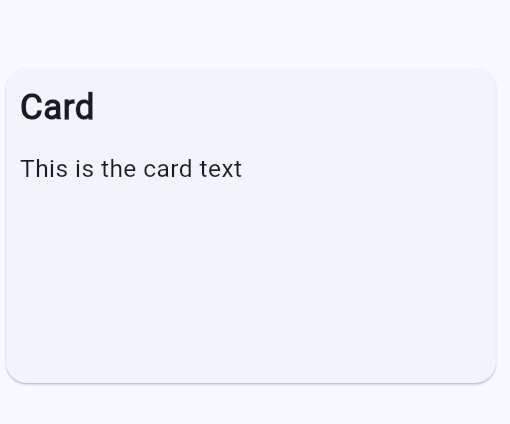
Custom Card with Header and Content
import 'package:flutter/material.dart';

void main() => runApp(const MyApp());

class CustomCard extends StatelessWidget {
  final String header;
  final String content;

  CustomCard({required this.header, required this.content});

  @override
  Widget build(BuildContext context) {
    return SizedBox(
        width: 300,
        height: 200,
        child: Card(
          margin: EdgeInsets.all(10),
          child: Padding(
            padding: const EdgeInsets.all(8.0),
            child: Column(
              crossAxisAlignment: CrossAxisAlignment.start,
              children: <Widget>[
                Text(
                  header,
                  style: TextStyle(fontSize: 20, fontWeight: FontWeight.bold),
                ),
                SizedBox(height: 10),
                Text(content),
              ],
            ),
          ),
        ));
  }
}

class MyApp extends StatelessWidget {
  const MyApp({super.key});

  @override
  Widget build(BuildContext context) {
    return MaterialApp(
      title: 'Demo App ',
      debugShowCheckedModeBanner: false,
      theme: ThemeData(
        colorSchemeSeed: Colors.blue,
      ),
      home: Scaffold(
          appBar: AppBar(title: const Text('Card')),
          body: Center(
              child: CustomCard(
            header: 'Card',
            content: 'This is the card text',
          ))),
    );
  }
}
Handling User Input
Custom widgets can also handle user input, making them interactive and dynamic.
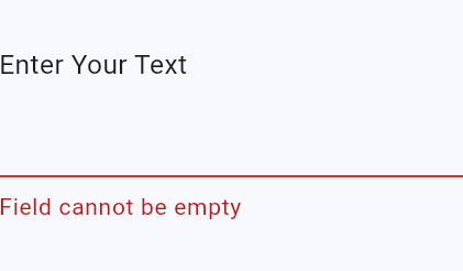
Custom Text Field with Validation
Open DartPad and write the following code:
import 'package:flutter/material.dart';

void main() => runApp(const MyApp());


class CustomTextField extends StatefulWidget {
  final String label;

  CustomTextField({required this.label});

  @override
  _CustomTextFieldState createState() => _CustomTextFieldState();
}

class _CustomTextFieldState extends State<CustomTextField> {
  final TextEditingController _controller = TextEditingController();
  String? errorMessage;

  void validateInput(String value) {
    setState(() {
      errorMessage = value.isEmpty ? 'Field cannot be empty' : null;
    });
  }

  @override
  Widget build(BuildContext context) {
    return Column(
      crossAxisAlignment: CrossAxisAlignment.start,
      children: <Widget>[
        Text(widget.label),
        TextField(
          controller: _controller,
          onChanged: validateInput,
          decoration: InputDecoration(
            errorText: errorMessage,
          ),
        ),
      ],
    );
  }
}


class MyApp extends StatelessWidget {
  const MyApp({super.key});

  @override
  Widget build(BuildContext context) {
    return MaterialApp(
      title: 'Demo App ',
      debugShowCheckedModeBanner: false,
      theme: ThemeData(
        colorSchemeSeed: Colors.blue,
      ),
      home: Scaffold(
          appBar: AppBar(title: const Text('Input')),
          body: Center(
              child: CustomTextField(
  label: 'Enter Your Text',
)


          )),
    );
  }
}
Custom Button in Flutter
Let’s create a CustomButton Stateless Widget :
class CustomButton extends StatelessWidget{

  final String label;
  final VoidCallback onPressed;
  final String buttonType;
  final Color colorOnPressed;

  CustomButton(
   {
    required this.label,
    required this.onPressed,
    this.buttonType = 'Elevated',
    this.colorOnPressed = Colors.black87
   });
}
In this example, the custom button can show an elevated button if the type of the button is not specified. If the button type is ‘Outlined’, then it will show an outlined button. Additionally, the color of the outlined button will change when tapped.
main.dart
import 'package:flutter/material.dart';
import 'package:flutter/widgets.dart';

class CustomButton extends StatelessWidget{

  final String label;
  final VoidCallback onPressed;
  final String buttonType;
  final Color colorOnPressed;

  CustomButton(
   {
    required this.label,
    required this.onPressed,
    this.buttonType = 'Elevated',
    this.colorOnPressed = Colors.black87
   });


  @override
  Widget build(BuildContext context) {

   return buttonType == 'Outlined' ?
   OutlinedButton(
    onPressed: onPressed, child: Text(label),

    style: ButtonStyle(
      backgroundColor: WidgetStateProperty.resolveWith<Color> (
        (Set<WidgetState> states) {
          if(states.contains(WidgetState.pressed)){
            return colorOnPressed;
          }
          //default color
          return Colors.blue.shade200;
        },
      ),
      side: WidgetStateProperty.all<BorderSide>(
        const BorderSide(color: Colors.red),
      )
    ),

    )

   : ElevatedButton(onPressed: onPressed, child: Text(label));

  }


}
Creating custom widgets in app enhances your application’s design, usability, and maintainability. By understanding the basics of StatelessWidget and StatefulWidget, and exploring advanced examples, you can start building your custom widgets efficiently.
The advantages of using custom widgets in a Flutter app include reusability, modularity, maintainability, customizability, readability, performance optimization, testability, and consistency.
Custom widgets ensure a consistent look and feel across your application. By defining standardized components, you maintain uniformity in design and interaction patterns.

