List Tile in Flutter : Let’s Customize List Tiles
List Tile in Flutter offers a simple way to create visually appealing lists. It provides a ready-to-use widget that simplifies list creation. In this tutorial, we’ll explore List Tile in Flutter in detail.
Why Use List Tile in Flutter?
List Tile in Flutter combines several elements into one cohesive widget. This includes icons, text, and even trailing widgets. Thus, it makes list creation efficient and straightforward.
Getting Started
To begin, ensure you have Flutter installed. Open your preferred code editor and create a new Flutter project. Next, open the lib/main.dart file. Here, we will start coding.
Basic List Tile Example
First, let’s create a basic List Tile in Flutter. This example shows a simple list with an icon and text.
import 'package:flutter/material.dart';

void main() => runApp(MyApp());

class MyApp extends StatelessWidget {
  @override
  Widget build(BuildContext context) {
    return MaterialApp(
      home: Scaffold(
        appBar: AppBar(
          title: const Text('List Tile in Flutter'),
        ),
        body: ListView(
          children: <Widget>[
            ListTile(
              leading: Icon(Icons.map),
              title: const Text('Map'),
            ),
            ListTile(
              leading: Icon(Icons.photo_album),
              title: const Text('Album'),
            ),
            ListTile(
              leading: Icon(Icons.phone),
              title: const Text('Phone'),
            ),
          ],
        ),
      ),
    );
  }
}
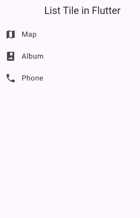
The ListView widget contains several ListTile widgets. Each ListTile has a leading icon and a title. Consequently, this creates a simple list with three items.
Customizing Tiles
You can customize List Tile to fit your needs. Let’s add a trailing icon and a subtitle.
        ListTile(
  leading: Icon(Icons.email),
  title: Text('Email'),
  subtitle: Text('example@bigknol.com'),
  trailing: Icon(Icons.send),
)
main.dart
import 'package:flutter/material.dart';

void main() => runApp(MyApp());

class MyApp extends StatelessWidget {
  @override
  Widget build(BuildContext context) {
    return MaterialApp(
      home: Scaffold(
        appBar: AppBar(
          title: const Text('Tile'),
        ),
        body:

        ListTile(
  leading: Icon(Icons.email),
  title: Text('Email'),
  subtitle: Text('example@bigknol.com'),
  trailing: Icon(Icons.send),
)


      ),
    );
  }
}
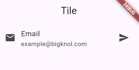
Adding a trailing icon and a subtitle enhances the information displayed. This is useful for more detailed lists.
Using onTap in List Tile
Adding interactivity makes the List Tile more dynamic. Let’s add an onTap handler.
      ListTile(
  leading: Icon(Icons.email),
  onTap: () {
    print("Hello");
  },
  title: Text('Email'),
  subtitle: Text('example@bigknol.com'),
  trailing: Icon(Icons.send),
)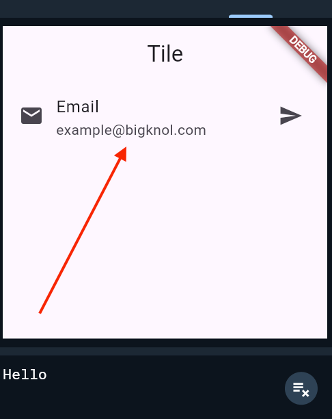
The onTap property adds interactivity. Consequently, tapping the list item triggers a function.
Advanced List Tile Examples
Now, let’s explore more advanced examples. We will use images and switch widgets.
List Tile with Image
Including images can make your list more engaging.
ListTile(
  leading: Image.network('https://cdn.pixabay.com/photo/2023/10/28/05/54/plane-8346567_960_720.png', width: 50, height: 50),
  title: Text('Fly'),
)
List Tile with Switch
Adding switches is useful for toggling settings.
      ListTile(
  leading: Icon(Icons.wifi),
  title: Text('Wi-Fi'),
  trailing: Switch(
    value: true,
    onChanged: (bool value) {},
  ),
)
Styling List Tile
Customizing the style improves the appearance of your list. You can change text style, icon color, and more.
Changing Text Style
ListTile(
  leading: Icon(Icons.event),
  title: Text(
    'Event',
    style: TextStyle(
      fontWeight: FontWeight.bold,
      color: Colors.blue,
    ),
  ),
)
Changing Icon Color
ListTile(
  leading: Icon(
    Icons.event,
    color: Colors.red,
  ),
  title: Text('Event'),
)
In conclusion, List Tile offers extensive customization. From basic lists to advanced interactive lists, List Tile is highly versatile. Implementing List Tile ensures your apps have clean, functional, and visually appealing lists.
Happy coding!


