
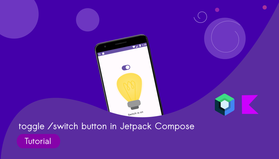
Switch Button in Jetpack Compose : Build A Light Switch App
Let’s use the switch button in Jetpack Compose with Android Studio Giraffe. If you are an absolute beginner, kindly refer to the ‘First App in Jetpack Compose‘ tutorial first.
Switch UI element in Jetpack Compose is used to represent a binary toggle switch, commonly used to enable or disable a feature or settings. In this Jetpack Compose tutorial, you will learn how to use switch button in Jetpack Compose application.
What are we going to build?
Light Switch App
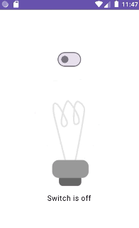
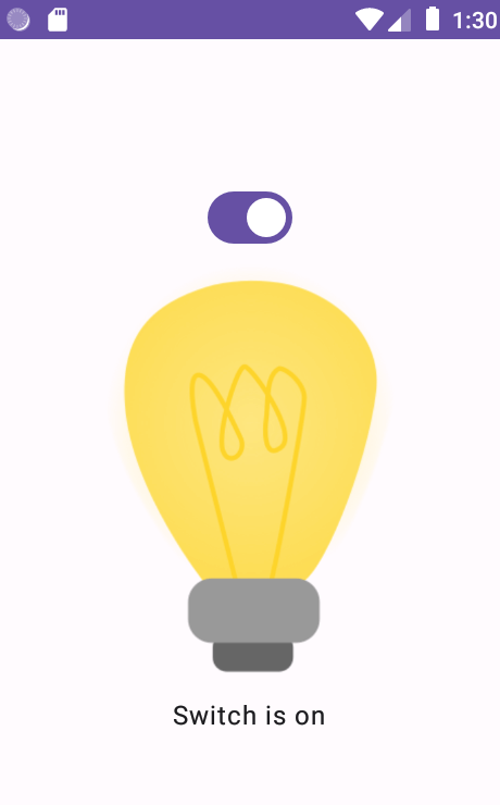
It’s a simple application that includes a toggle button (a switch element) to control the light. We’ll use two images to demonstrate the on/off effect of the light.
Step 1: Set up a Jetpack Compose Project
Before working with Jetpack Compose, you need to set up a Compose project. You can do this in Android Studio (Giraffe) by creating a new project and selecting `Empty Activity` template.
You can create a Switch UI element using Switch composable.
Switch(
         // app logic here
        )
Step 2 : Add images to Resource Manager
Click Resource Manger > + button > Import Drawables. Choose the downloaded bulb images.
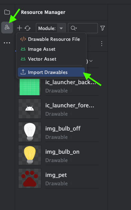
The images are given below:


Step 3: Toggle (Switch) button in Jetpack Compose
Let’s create a composable function showSwitch()
@Composable
fun showSwitch(){
    val checked = remember { mutableStateOf(true) }

}
We use remember { mutableStateOf(true) } to create a mutable state that holds the switch’s current state.
Let’s add a Column inside the showSwitch() composable function.
Column(modifier = Modifier
        .padding(25.dp)
        .fillMaxSize(),
        verticalArrangement = Arrangement.Center,
        horizontalAlignment = Alignment.CenterHorizontally,
        ) {
}
Add Switch inside the Column:
  Switch(
            checked = checked.value,
            onCheckedChange = {checked.value = it}
)checked: A boolean value that represents the state of the switch.
onCheckedChange: A lambda function that is called when the switch state changes.
showSwitch() [Complete code]
@Composable
fun showSwitch(){
    val checked = remember { mutableStateOf(true) }
    Column(modifier = Modifier
        .padding(25.dp)
        .fillMaxSize(),
        verticalArrangement = Arrangement.Center,
        horizontalAlignment = Alignment.CenterHorizontally,
        ) {

        Switch(
            checked = checked.value,
            onCheckedChange = {checked.value = it}
        )
        Image(painter = if (checked.value) painterResource(id = R.drawable.img_bulb_on) else  painterResource(id = R.drawable.img_bulb_off), contentDescription = "Bulb Status")

        if(checked.value)
        {
            Text("Switch is on")
        }else {
            Text("Switch is off")
        }
    }

}
Image is a composable to display an image of bulb, and the image displayed on the value of a variable called `checked`.
painter is a parameter that specifies the image to display. It uses a conditional expression: if checked.value is true, it displays an image with the ID R.drawable.img_bulb_on, which is the image of a lit bulb. If checked.value is false, it displays an image with the ID R.drawable.img_bulb_off, which is the image of a turned-off bulb.
contentDescription provides an accessibility description for the image, which is “Bulb Status.” This is useful for accessibility features like screen readers.
Complete code: composable_switch.kt
package com.bigknol.allrunner.composables


import androidx.compose.foundation.Image
import androidx.compose.foundation.layout.Arrangement

import androidx.compose.foundation.layout.Column
import androidx.compose.foundation.layout.fillMaxSize
import androidx.compose.foundation.layout.padding

import androidx.compose.material3.Switch
import androidx.compose.material3.Text
import androidx.compose.runtime.Composable
import androidx.compose.runtime.mutableStateOf
import androidx.compose.runtime.remember
import androidx.compose.ui.Alignment
import androidx.compose.ui.Modifier
import androidx.compose.ui.res.painterResource
import androidx.compose.ui.unit.dp
import com.bigknol.todolistapp.R


@Composable
fun showSwitch(){
    val checked = remember { mutableStateOf(true) }
    Column(modifier = Modifier
        .padding(25.dp)
        .fillMaxSize(),
        verticalArrangement = Arrangement.Center,
        horizontalAlignment = Alignment.CenterHorizontally,
        ) {

        Switch(
            checked = checked.value,
            onCheckedChange = {checked.value = it}
        )
        Image(painter = if (checked.value) painterResource(id = R.drawable.img_bulb_on) else  painterResource(id = R.drawable.img_bulb_off), contentDescription = "Bulb Status")

        if(checked.value)
        {
            Text("Switch is on")
        }else {
            Text("Switch is off")
        }
    }

}
MainActivity.kt
import android.os.Bundle
import androidx.activity.ComponentActivity
import androidx.activity.compose.setContent
import androidx.compose.foundation.layout.fillMaxSize
import androidx.compose.material3.MaterialTheme
import androidx.compose.material3.Surface
import androidx.compose.runtime.Composable
import androidx.compose.ui.Modifier
import androidx.compose.ui.tooling.preview.Preview
import com.bigknol.allrunner.composables.showSwitch
import com.bigknol.allrunner.ui.theme.ToDoListAppTheme

class MainActivity : ComponentActivity() {
    override fun onCreate(savedInstanceState: Bundle?) {
        super.onCreate(savedInstanceState)
        setContent {
            ToDoListAppTheme {
                // A surface container using the 'background' color from the theme
                Surface(
                    modifier = Modifier.fillMaxSize(),
                    color = MaterialTheme.colorScheme.background
                ) {
                //call showSwitch [composable]
                showSwitch()


                }
            }
        }
    }
}


@Preview(showBackground = true)
@Composable
fun GreetingPreview2() {
    ToDoListAppTheme {
        showSwitch()

    }
}
Happy Composing!