
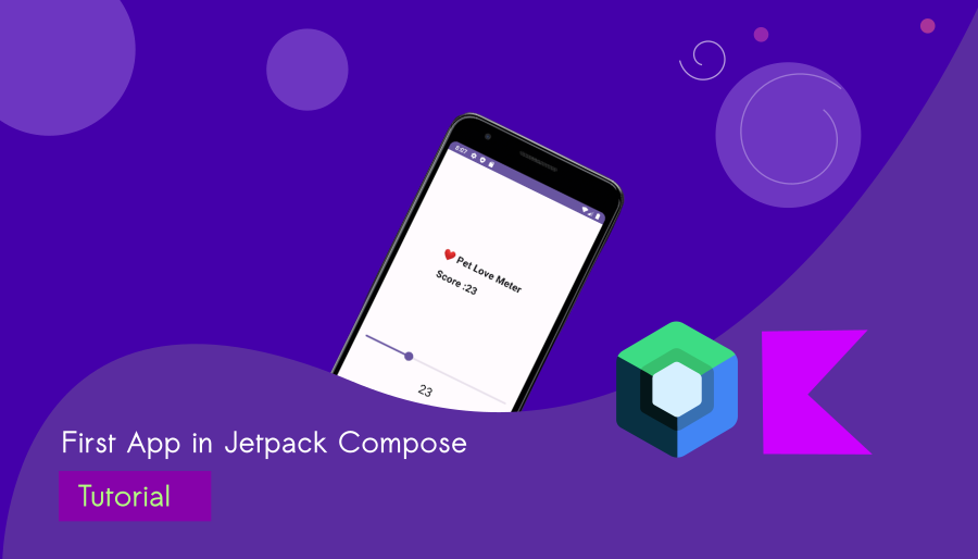
Build an App in Jetpack Compose with Android Studio
Let’s build your first Android app in Jetpack Compose using the latest version of Android Studio, codenamed ‘Giraffe’.
We used to start with a traditional ‘Hello World‘ app. Nowadays, many beginner coders prefer tackling a challenging task at the outset of their learning journey. Therefore, we made the decision to create an app called ‘Pet Love Scale.’ While this app may appear simple at first glance, it offers some exciting features that can significantly enhance your Android app development skills. Let’s start with a Jetpack Compose Android app tutorial.
What are we going to build?
We’re creating a simple app in Jetpack Compose that includes a scaler to display your love for your favorite pet at home. It’s a straightforward and entertaining app, and our primary focus is to provide you with plenty of opportunities to learn.

What is Jetpack Compose?
Google developed Jetpack Compose as a modern Android UI toolkit to facilitate developers in creating user interfaces for Android apps more easily. It’s a significant departure from the traditional way of building Android user interfaces and offers a more intuitive and declarative approach.
In simpler terms, Jetpack Compose allows developers to design the visual elements of an app by describing how they should look and behave, almost like creating a digital painting. Instead of writing complex XML layouts, developers write code that defines the UI components, such as buttons, text, and images, and how they should interact with each other.
One of the key advantages of Jetpack Compose is its real-time preview feature, which lets developers see how the user interface will look as they write the code, making it easier to experiment and make quick adjustments. This results in a more streamlined and efficient development process.
Jetpack Compose is a game-changer in Android app development, allowing developers to create beautiful and functional user interfaces more easily and efficiently than ever before. It’s a tool that empowers developers to bring their creative ideas to life in a more intuitive and enjoyable way.
Where does Giraffe come from?

Android Studio Giraffe is the latest addition to the Android Studio version family. This integrated development environment (IDE) is a powerful tool crafted for the creation of Android applications. Developed by Google, it’s the go-to tool for Android app developers.
Android Studio offers a user-friendly interface that streamlines app development and includes a wide range of features to boost productivity. It comes with built-in emulators for testing, a code editor with smart coding suggestions, and an array of tools for debugging, profiling, and designing user interfaces.
Android Studio is not only made for Jetpack Compose development; it can also be used for creating Flutter apps, Kotlin Android apps, and Kotlin multi-platform apps.
Let’s stop the tech talks! Let’s start building your first functional app in Jetpack Compose.
Step 1: Let’s Prepare the IDE (Android Studio Giraffe)
The IDE is available for everyone. If you haven’t installed Android Studio yet, simply download it from the official channel.
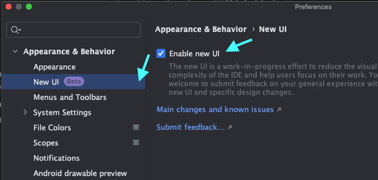
Change the look and feel of Android Studio
The IDE has unveiled a fresh development UI. If you want to modify the UI, follow the steps below:
1. Open Preference (Mac) / Settings (Windows) in Android Studio
2. Goto Appearance & Behavior -> New UI -> Enabled new UI
Step 2: Let’s Create a Jetpack Compose Project in Android Studio Giraffe
Open Android Studio and Choose New Project
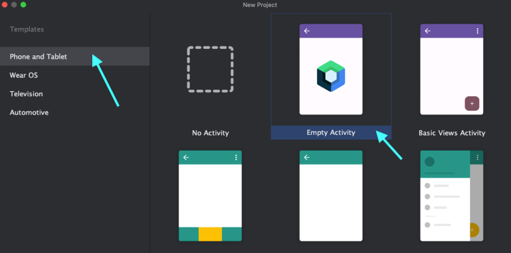
Select Phone and Tablet and Select ‘Empty Activity‘
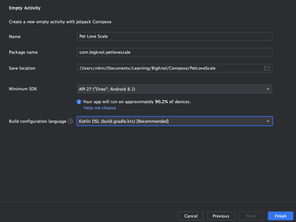
Name : Pet Love Scale (Give your app name here.)
Package Name : com.bigknol.petlovescale

What is Android Package name?
In Android, a package name serves as a distinctive identifier for your app, functioning much like an address that enables the Android operating system to distinguish and categorize your app among the multitude of apps on a device.
Typically, the package name adheres to a specific format, such as “com.example.yourappname,” which often reflects the reverse of your website or app domain name. This package name is defined within your app’s manifest file.
Save location
This is the location where our project files are stored and updated.
Minimum SDK
The Minimum SDK (Software Development Kit) is the earliest version of the Android operating system that your app supports.
Build configuration language : Kotlin DSL (build.gradle.kts)
The Build configuration language in Android development, particularly the Kotlin DSL, is the format employed to specify the build settings and configuration for an Android project.
Final Step is to hit that Finish button.
Step 3 Understanding the key components of our project
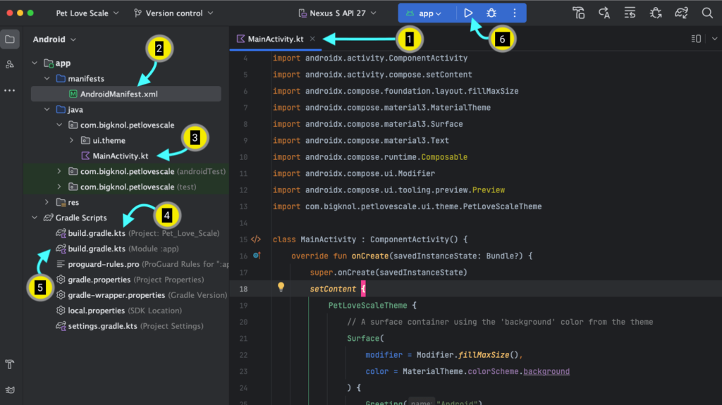
Android Studio will generate a basic app in Jetpack Compose for us, including a theme and some composable functions. Familiarize yourself with the main components.
1, 3. MainActivity
This is the main entry point of our ‘Pet Love Scale’ app, where the code execution starts.
2. AndroidManifest.xml
In Android development, the “AndroidManifest.xml” file, often called the manifest, serves as a vital configuration file located at the root of every Android app project. It encompasses essential app details, permissions, Intent filters, and more.
4. build.gradle.kts (Project)
The build.gradle.kts (Project) file in an Android Studio app is used for configuring settings and dependencies at the project level. It is s used to configure project-wide settings, dependencies, and build tools that are essential.
5. build.gradle.kts (Module)
The build.gradle.kts file comprises configuration blocks and scripts that delineate a range of elements within an Android project, including dependencies, plugins, version details, compilation settings, and additional parameters.
6. Run ‘App’
This option allows us to run our app on either an emulator or a real device connected to our computer.
Step 4: Let’s make some changes
The starter code may look like this.
MainActivity.kt
package com.bigknol.petlovescale

import android.os.Bundle
import androidx.activity.ComponentActivity
import androidx.activity.compose.setContent
import androidx.compose.foundation.layout.fillMaxSize
import androidx.compose.material3.MaterialTheme
import androidx.compose.material3.Surface
import androidx.compose.material3.Text
import androidx.compose.runtime.Composable
import androidx.compose.ui.Modifier
import androidx.compose.ui.tooling.preview.Preview
import com.bigknol.petlovescale.ui.theme.PetLoveScaleTheme

class MainActivity : ComponentActivity() {
    override fun onCreate(savedInstanceState: Bundle?) {
        super.onCreate(savedInstanceState)
        setContent {
            PetLoveScaleTheme {
                // A surface container using the 'background' color from the theme
                Surface(
                    modifier = Modifier.fillMaxSize(),
                    color = MaterialTheme.colorScheme.background
                ) {
                    Greeting("Android")
                }
            }
        }
    }
}

@Composable
fun Greeting(name: String, modifier: Modifier = Modifier) {
    Text(
        text = "Hello $name!",
        modifier = modifier
    )
}

@Preview(showBackground = true)
@Composable
fun GreetingPreview() {
    PetLoveScaleTheme {
        Greeting("Android")
    }
}
Let’s remove the Greeting() function from MainActivity.kt
MainActivity.kt
package com.bigknol.petlovescale

import android.os.Bundle
import androidx.activity.ComponentActivity
import androidx.activity.compose.setContent
import androidx.compose.foundation.layout.fillMaxSize
import androidx.compose.material3.MaterialTheme
import androidx.compose.material3.Surface
import androidx.compose.material3.Text
import androidx.compose.runtime.Composable
import androidx.compose.ui.Modifier
import androidx.compose.ui.tooling.preview.Preview
import com.bigknol.petlovescale.ui.theme.PetLoveScaleTheme

class MainActivity : ComponentActivity() {
    override fun onCreate(savedInstanceState: Bundle?) {
        super.onCreate(savedInstanceState)
        setContent {
            PetLoveScaleTheme {
                // A surface container using the 'background' color from the theme
                Surface(
                    modifier = Modifier.fillMaxSize(),
                    color = MaterialTheme.colorScheme.background
                ) {

                }
            }
        }
    }
}


@Preview(showBackground = true)
@Composable
fun GreetingPreview() {
    PetLoveScaleTheme {

    }
}
Create a composable function ‘petText()’ after the MainActivity class ends.
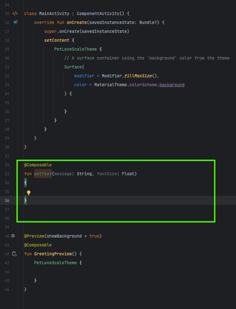
petText
@Composable
fun petText(message: String, fontSize: Float)
{

}
What is a composable function in Jetpack Compose?

In simple terms, a composable function in Jetpack Compose is like a building block for creating the user interface (UI) of an Android app. It’s a special kind of function that you use to describe how a part of your app’s UI should look and behave. These functions are easy to reuse and nest together, allowing you to build your app’s UI using code, without the need for complex XML layout files.
Let’s add a Text composable function to `petText()`
@Composable
fun petText(message: String, fontSize: Float)
{
    Text(
        text = message,
        fontSize = fontSize.sp,
        fontWeight = FontWeight.Bold)
}
message: This is a string parameter that represents the text you want to display using the Text composable.
fontSize: This is a float parameter that specifies the font size of the text in SP (scale-independent pixels). It allows you to customize the text size.
Inside the petText composable function, it uses the Text composable to display the text with the following
properties:
text: It sets the content of the text to be the message parameter, which is the text you want to display.
fontSize: It sets the font size of the text to the value specified by the fontSize parameter.
fontWeight: It sets the font weight to “Bold” using FontWeight.Bold.
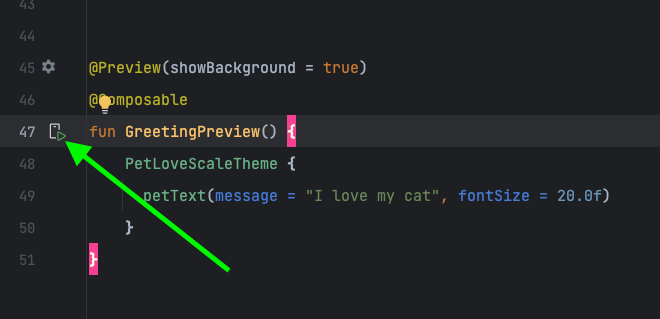
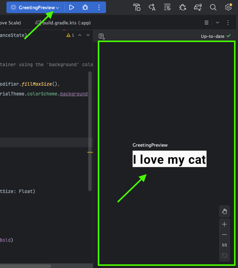
Let’s test our petText() with Android Studio’s Preview
Call petText() from GreetingPreview():
@Preview(showBackground = true)
@Composable
fun GreetingPreview() {
    PetLoveScaleTheme {
      petText(message = "I love my cat", fontSize = 20.0f)
    }
}
Click the Preview button on the left side.
Oh no! I haven’t seen anything.
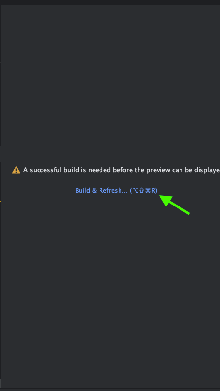
“A successful build is needed before the preview can be displayed”.
Click ‘Build & Refresh‘
Warning : You may encounter some warnings or errors during this process, depending on your current target SDK. If you encounter something like that, please refer to the #ERROR 1 section of this article.
After making these changes, MainActivity.kt might look like the following:
package com.bigknol.petlovescale

import android.os.Bundle
import androidx.activity.ComponentActivity
import androidx.activity.compose.setContent
import androidx.compose.foundation.layout.fillMaxSize
import androidx.compose.material3.MaterialTheme
import androidx.compose.material3.Surface
import androidx.compose.material3.Text
import androidx.compose.runtime.Composable
import androidx.compose.ui.Modifier
import androidx.compose.ui.text.font.FontWeight
import androidx.compose.ui.tooling.preview.Preview
import androidx.compose.ui.unit.sp
import com.bigknol.petlovescale.ui.theme.PetLoveScaleTheme

class MainActivity : ComponentActivity() {
    override fun onCreate(savedInstanceState: Bundle?) {
        super.onCreate(savedInstanceState)
        setContent {
            PetLoveScaleTheme {
                // A surface container using the 'background' color from the theme
                Surface(
                    modifier = Modifier.fillMaxSize(),
                    color = MaterialTheme.colorScheme.background
                ) {

                }
            }
        }
    }
}

@Composable
fun petText(message: String, fontSize: Float)
{
    Text(
        text = message,
        fontSize = fontSize.sp,
        fontWeight = FontWeight.Bold)
}


@Preview(showBackground = true)
@Composable
fun GreetingPreview() {
    PetLoveScaleTheme {
      petText(message = "I love my cat", fontSize = 20.0f)
    }
}
It’s time to run our app on an emulator or a real device. Let’s create a virtual device.
Step 5: Create a virtual device on Android Studio Giraffe
Goto Tools (menu) > Device Manager > Create Device.
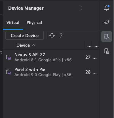
Select Phone from Virtual Device Configuration. Click on Pixel 3a then hit Next (It will one of the system images. eg. Pie), again click on Next.
AVD Name : Pixel 3a API 28
Finally, Press the Finish button.
Step 6: Run on an Emulator
Add the petText(…) inside the Surface() of PetLoveScaleTheme{..}
Now, the MainActivity class will look like this.
class MainActivity : ComponentActivity() {
    override fun onCreate(savedInstanceState: Bundle?) {
        super.onCreate(savedInstanceState)
        setContent {
            PetLoveScaleTheme {
                // A surface container using the 'background' color from the theme
                Surface(
                    modifier = Modifier.fillMaxSize(),
                    color = MaterialTheme.colorScheme.background
                ) {
                    petText(message = "I love my cat", fontSize = 20.0f)
                }
            }
        }
    }
}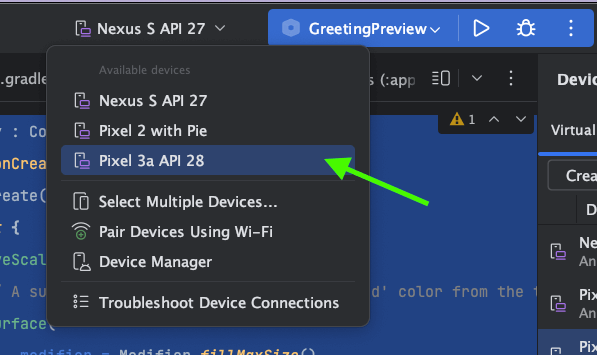
Select the created virtual device from the drop down list (eg: Pixel 3a API 28)
How to switch from Jetpack Compose Preview to App (Run) on Android Studio?
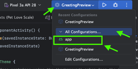
Step 1: Click on the Preview Drop down and Select All Configurations… then choose app from the list.
Step 2: Run the app by clicking the play button like below:
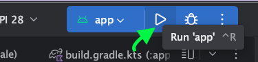
You can try with a keyboard shortcut Ctrl+ R.
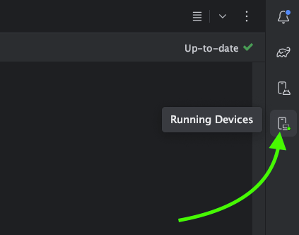
Click on the Running Devices button to see our emulator along with Preview window.
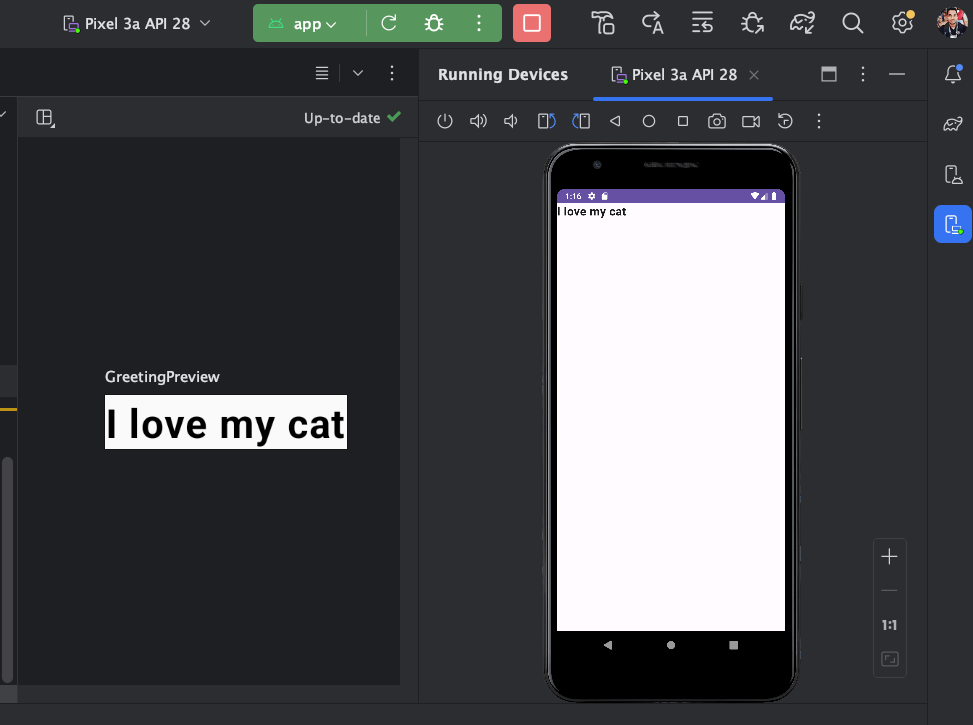
Hey I made an app!
Step 7 : Now make an app in Jetpack Compose [Pet Love Scale ❤️]
Create petSlider() composable function
// pet slider
@Composable
fun petSlider(petSliderPosition: Float, onPositionChange: (Float) -> Unit){
    Slider(
        modifier = Modifier.padding(10.dp),
        valueRange = 20f..30f,
        value = petSliderPosition,
        onValueChange = {onPositionChange(it)}
    )
}
The petSlider is a user interface element (for pet love scale app) created using Jetpack Compose. It takes two parameters: petSliderPosition (the current position of the slider) and onPositionChange (a function to handle changes in the slider position). It uses a Slider composable, specifies its properties like range and value, and connects the value change to the onPositionChange function.
Design the UI
Let’s create petScreen() Composable function :
fun petScreen(){
var sliderPosition by remember{ mutableStateOf(20f) }
val handleChange = {position: Float -> sliderPosition = position}
Column(
horizontalAlignment = Alignment.CenterHorizontally,
verticalArrangement = Arrangement.Center,
modifier = Modifier.fillMaxSize())
{
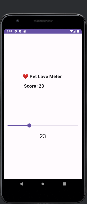
petText(message = "❤️ Pet Love Meter \n\n Score :" + sliderPosition.toInt().toString() , fontSize = sliderPosition)
Spacer(modifier = Modifier.height(150.dp))
petSlider(petSliderPosition = sliderPosition, onPositionChange = handleChange)
Text(
style = MaterialTheme.typography.headlineMedium,
text = sliderPosition.toInt().toString()
)
}
}Let’s break down the code:
var sliderPosition by remember{ mutableStateOf(20f) }
    val handleChange = {position: Float -> sliderPosition = position}
This first line declares a variable named sliderPosition and initializes it using the remember and mutableStateOf combination. It sets the initial value of sliderPosition to 20f (a floating-point number). The handleChange in the code is defined as a lambda expression that takes a single parameter, position, which is a floating-point number.
When the lambda is invoked, it updates the sliderPosition variable with the value of position. This lambda can be used as a callback or event handler, often employed in frameworks like Jetpack Compose for handling user interactions and state updates in a more concise and functional manner.
Column Composable Function
In simple terms, the Column composable function in Jetpack Compose is like a vertical stack of UI elements. You can use it to arrange things on your app’s screen, placing items on top of each other, much like stacking books on a shelf.
 Column(
        horizontalAlignment = Alignment.CenterHorizontally,
        verticalArrangement = Arrangement.Center,
        modifier = Modifier.fillMaxSize())
horizontalAlignment = Alignment.CenterHorizontally,: It sets the horizontal alignment of the Column to be centered, meaning that the contents within the Column will be horizontally centered.
verticalArrangement = Arrangement.Center,: It sets the vertical arrangement of the Column to be centered, which means that the contents within the Column will be vertically centered.
modifier = Modifier.fillMaxSize()) {}: This part defines a modifier for the Column. The Modifier.fillMaxSize() modifier instructs the Column to occupy the maximum available space both horizontally and vertically. This modifier allows the Column to take up the entire available screen space.
petText(message = "❤️ Pet Love Meter \n\n Score :" + sliderPosition.toInt().toString() , fontSize = sliderPosition)Let’s break down each item
message = “❤️ Pet Love Meter \n\n Score :” + sliderPosition.toInt().toString(): This parameter sets the message or text to be displayed. It’s a string that combines several parts:
“❤️ Pet Love Meter”: This is a static text that appears at the beginning of the message.
“\n\n”: These are newline characters, which create two line breaks, making the following text appear on separate lines.
“Score :” + sliderPosition.toInt().toString(): This part dynamically generates the score value.
It takes the sliderPosition, converts it to an integer, and appends it to “Score :”.
fontSize = sliderPosition: This parameter specifies the font size for the text. It uses the value of sliderPosition as the font size, which means the font size may change dynamically based on the value of the slider.
Spacer: This line defines the Spacer composable element.
modifier = Modifier.height(150.dp): This is a parameter that specifies a modifier for the Spacer. The Modifier.height(150.dp) modifier sets the height of the Spacer to be 150 density-independent pixels (dp).
petSlider(petSliderPosition = sliderPosition, onPositionChange = handleChange)petSliderPosition = sliderPosition: This parameter petSliderPosition is set to the value of sliderPosition.
 Text(
            style = MaterialTheme.typography.headlineMedium,
            text = sliderPosition.toInt().toString()
        )
This code displays text with the style defined as “headlineMedium” from the MaterialTheme. It shows the integer value of sliderPosition.
Step 8: Run ‘Pet Love Scale app’
Before you run the app, you must call petScreen() from Surface()
setContent {
            PetLoveScaleTheme {
                // A surface container using the 'background' color from the theme
                Surface(
                    modifier = Modifier.fillMaxSize(),
                    color = MaterialTheme.colorScheme.background
                ) {
                   // petText(message = "I love my cat", fontSize = 20.0f)
                    petScreen()

                }
            }
        }
MainActivity.kt [Complete code]
package com.bigknol.petlovescale

import android.os.Bundle
import androidx.activity.ComponentActivity
import androidx.activity.compose.setContent
import androidx.compose.foundation.layout.Arrangement
import androidx.compose.foundation.layout.Column
import androidx.compose.foundation.layout.Spacer
import androidx.compose.foundation.layout.fillMaxSize
import androidx.compose.foundation.layout.height
import androidx.compose.foundation.layout.padding
import androidx.compose.material3.MaterialTheme
import androidx.compose.material3.Slider
import androidx.compose.material3.Surface
import androidx.compose.material3.Text
import androidx.compose.runtime.Composable
import androidx.compose.runtime.getValue
import androidx.compose.runtime.mutableStateOf
import androidx.compose.runtime.remember
import androidx.compose.runtime.setValue
import androidx.compose.ui.Alignment
import androidx.compose.ui.Modifier
import androidx.compose.ui.text.font.FontWeight
import androidx.compose.ui.tooling.preview.Preview
import androidx.compose.ui.unit.dp
import androidx.compose.ui.unit.sp
import com.bigknol.petlovescale.ui.theme.PetLoveScaleTheme

class MainActivity : ComponentActivity() {
    override fun onCreate(savedInstanceState: Bundle?) {
        super.onCreate(savedInstanceState)
        setContent {
            PetLoveScaleTheme {
                // A surface container using the 'background' color from the theme
                Surface(
                    modifier = Modifier.fillMaxSize(),
                    color = MaterialTheme.colorScheme.background
                ) {
                   // petText(message = "I love my cat", fontSize = 20.0f)
                    petScreen()

                }
            }
        }
    }
}

@Composable
fun petText(message: String, fontSize: Float)
{
    Text(
        text = message,
        fontSize = fontSize.sp,
        fontWeight = FontWeight.Bold)
}
// pet slider
@Composable
fun petSlider(petSliderPosition: Float, onPositionChange: (Float) -> Unit){
    Slider(
        modifier = Modifier.padding(10.dp),
        valueRange = 20f..30f,
        value = petSliderPosition,
        onValueChange = {onPositionChange(it)}
    )
}

@Composable
fun petScreen(){
    var sliderPosition by remember{ mutableStateOf(20f) }
    val handleChange = {position: Float -> sliderPosition = position}
    Column(
        horizontalAlignment = Alignment.CenterHorizontally,
        verticalArrangement = Arrangement.Center,
        modifier = Modifier.fillMaxSize())
    {

        petText(message = "❤️ Pet Love Meter \n\n Score :" + sliderPosition.toInt().toString() , fontSize = sliderPosition)
        Spacer(modifier = Modifier.height(150.dp))
        petSlider(petSliderPosition = sliderPosition, onPositionChange = handleChange)
        Text(
            style = MaterialTheme.typography.headlineMedium,
            text = sliderPosition.toInt().toString()
        )
    }
}


@Preview(showBackground = true)
@Composable
fun GreetingPreview() {
    PetLoveScaleTheme {
      petText(message = "I love my cat", fontSize = 20.0f)
    }
}
Run your app:
Happy Ending!
Wow! I just completed my app journey.
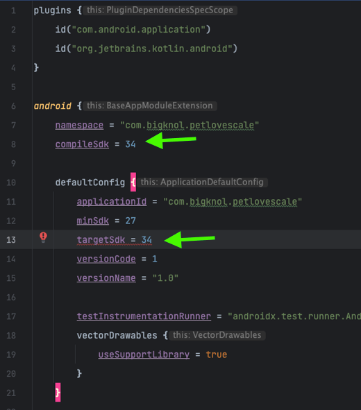
ERROR #1
“Dependency ‘androidx.activity:activity:1.8.0’ requires libraries and applications that
depend on it to compile against version 34 or later of the
Android APIs.” (:app is currently compiled against android-33.)
“Dependency ‘androidx.activity:activity-ktx:1.8.0’ requires libraries and applications that
depend on it to compile against version 34 or later of the
Android APIs.”
“Dependency ‘androidx.activity:activity-compose:1.8.0’ requires libraries and applications that
depend on it to compile against version 34 or later of the
Android APIs.”
Solution
Open build.gradle.kts and change compileSdk and targetSdk to 34
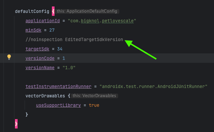
You can also fix the warning message under targetSdk like below:
Happy Coding!
![How to Add an Image in Jetpack Compose App [Example]](https://bigknol.com/wp-content/uploads/2023/10/add_images_to_jetpack_compose_app-520x245.png)

