Flutter AppBar Customization : Color, Actions and More
In Flutter the AppBar widget is common UI component used to create the top app bars, typically used for displaying titles, leading and trailing widgets, handling navigation actions. Let’s customize the Flutter AppBar with some useful properties.

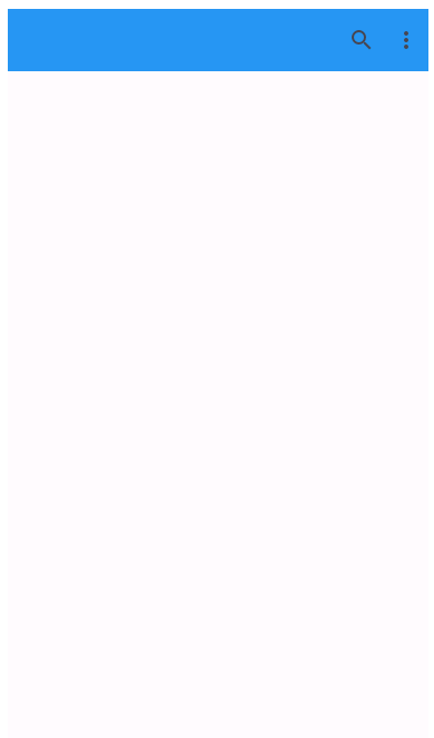
1. Setting up the Title & Background Color for Flutter AppBar
The title displayed in the center of the app bar. backgroundColor: The background color of the app bar.
appBar : AppBar(

    title: const Text('App Bar Demo'),
    backgroundColor: Colors.blue,


    )
main.dart
import 'package:flutter/material.dart';


void main() {
runApp(AppBarDemo());
}
class AppBarDemo extends StatelessWidget {

  @override
  Widget build(BuildContext context)
  {
    return MaterialApp(

     debugShowCheckedModeBanner: false,
     home: MyApp()

    );
  }

}
class MyApp extends StatelessWidget {

  @override
  Widget build(BuildContext context)
  {
    return Scaffold(
    appBar : AppBar(

    title: const Text('App Bar Demo'),
    backgroundColor: Colors.blue,


    )
    );
  }

}
2. Let’s Change the Color of AppBar Text
appBar : AppBar(

    title: const Text('App Bar Demo'),
    backgroundColor: Colors.blue,
    foregroundColor: Colors.white,
     )
3. AppBar Elevation
elevation: The elevation of the app bar, which controls the shadow.
appBar : AppBar(

    title: const Text('App Bar Demo'),
    backgroundColor: Colors.blue,
    elevation: 4.0,
     )
4. Center the Title
Scaffold(
    appBar : AppBar(

    title: const Text('App Bar Demo'),
    backgroundColor: Colors.blue,
    centerTitle: true,

     )
    );
5. automaticallyImplyLeading (Property)
Whether to automatically add a leading widget (back button) if none is provided.
AppBar(

    title: const Text('App Bar Demo'),
    backgroundColor: Colors.blue,
    centerTitle: true,
    automaticallyImplyLeading: false

     )
6. Actions: Add IconButtons in an AppBar
actions: A list of widgets to display after the title, typically used for action buttons.
 actions: <Widget>[
    IconButton(
      icon: Icon(Icons.search),
      onPressed: () {
        // handle search button press
        print('Clicked on Search Button');
      },
    ),
    IconButton(
      icon: Icon(Icons.more_vert),
      onPressed: () {
         print('Clicked on More');
      },
    ),
  ],
main.dart
Open DartPad and write the following code:
import 'package:flutter/material.dart';


void main() {
runApp(AppBarDemo());
}
class AppBarDemo extends StatelessWidget {

  @override
  Widget build(BuildContext context)
  {
    return MaterialApp(

     debugShowCheckedModeBanner: false,
     home: MyApp()

    );
  }

}
class MyApp extends StatelessWidget {

  @override
  Widget build(BuildContext context)
  {
    return Scaffold(
    appBar : AppBar(
    backgroundColor: Colors.blue,

    actions: <Widget>[
    IconButton(
      icon: Icon(Icons.search),
      onPressed: () {
        // handle search button press
        print('Clicked on Search Button');
      },
    ),
    IconButton(
      icon: Icon(Icons.more_vert),
      onPressed: () {
         print('Clicked on More');
      },
    ),
  ],
)
    );
  }

}
7. Fully Customized AppBar in Flutter
import 'package:flutter/material.dart';

void main() {
  runApp(MyApp());
}

class MyApp extends StatelessWidget {
  @override
  Widget build(BuildContext context) {
    return MaterialApp(
      theme: ThemeData(
     useMaterial3: true,
    colorSchemeSeed: Colors.green,
  ),
      debugShowCheckedModeBanner: false,

      home: Scaffold(

        appBar: AppBar(
          title: Text(
            'Customized App Bar',
            style: TextStyle(
              fontSize: 20.0,
              fontWeight: FontWeight.bold,
              color: Colors.white,
            ),
          ),
          backgroundColor: Colors.blueAccent,
          elevation: 4.0,
          centerTitle: true,
          leading: IconButton(
            icon: Icon(Icons.menu, color: Colors.white),
            onPressed: () {
              // handle menu button press
            },
          ),
          actions: <Widget>[
            IconButton(
              icon: Icon(Icons.search, color: Colors.white),
              onPressed: () {
                // handle search button press
              },
            ),
            IconButton(
              icon: Icon(Icons.more_vert, color: Colors.white),
              onPressed: () {
                // handle more options button press
              },
            ),
          ],
        ),
        body: Center(
          child: Text(
            'Customized App Bar Example',
            style: TextStyle(fontSize: 20.0),
          ),
        ),
        floatingActionButton: FloatingActionButton(

          onPressed: () {
            // Add your onPressed function here
          },
          child: Icon(Icons.add),
          backgroundColor: Colors.blueAccent,
        ),
      ),
    );
  }
}
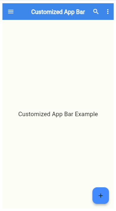
- The title text has been customized with a larger font size and bold weight.
- The background color of the app bar is set to Colors.blueAccent.
- The elevation is increased to 4.0 for a more pronounced shadow effect.
- A leading widget (menu icon) is added to the left of the title.
- Action buttons include search and more options icons.
- A floating action button (FAB) is added to the Scaffold, which is often used for primary user actions. In this case, it displays an add icon and has a blue accent background color.
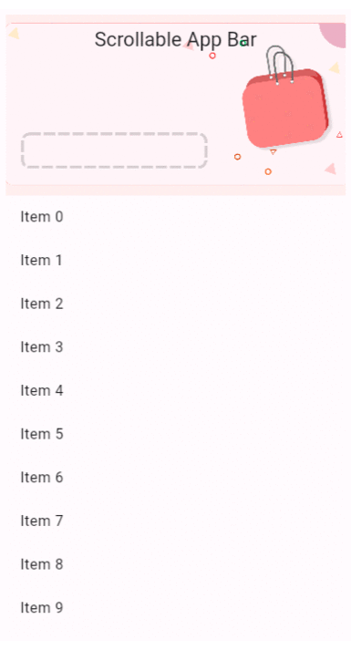
8. Change Color / Image when Scroll the content
To change the color/image of the app bar when scrolling, you can use the SliverAppBar widget along with a CustomScrollView.
import 'package:flutter/material.dart';

void main() {
  runApp(MyApp());
}

class MyApp extends StatelessWidget {
  @override
  Widget build(BuildContext context) {
    return MaterialApp(
      debugShowCheckedModeBanner: false,
      home: Scaffold(
        body: CustomScrollView(
          slivers: <Widget>[
            SliverAppBar(
              title: Text('Scrollable App Bar'),
              backgroundColor: Colors.blue, // Initial background color
              expandedHeight: 200.0,
              floating: true,
              pinned: true,
              flexibleSpace: FlexibleSpaceBar(
                background: Image.network(
                  'https://cdn.pixabay.com/photo/2022/11/30/12/29/shopping-7626678_1280.png', // Sample image URL
                  fit: BoxFit.cover,
                ),
              ),
            ),
            SliverList(
              delegate: SliverChildBuilderDelegate(
                (BuildContext context, int index) {
                  return ListTile(
                    title: Text('Item $index'),
                  );
                },
                childCount: 50, // demonstration
              ),
            ),
          ],
        ),
      ),
    );
  }
}
These are just a few of the properties available in the AppBar widget in Flutter. You can combine these properties to create custom app bars tailored to your app’s design and functionality.
The AppBar widget is highly customizable and can be tailored to match the design and functionality requirements of various applications.
Happy Coding!