
How to Add an Image in Jetpack Compose App [Example]
Adding an image in Jetpack Compose is a straightforward process, and this tutorial will guide you through it in just a few simple steps. Jetpack Compose is a modern Android UI toolkit that simplifies the creation of beautiful and interactive user interfaces. To incorporate an image, follow these steps.
Step 1: Prepare your Project and IDE
If you are a beginner, you can begin with the ‘First App in Jetpack Compose’ tutorial. Start by downloading and installing the latest version of Android Studio, and then create a new Jetpack Compose project.
Step 2: Add an image using Resource Manager (Android Studio)
Find the image and download it to your computer, for instance (download the call icon).
Launch the Android Studio IDE:

Click on ‘Resource Manager‘
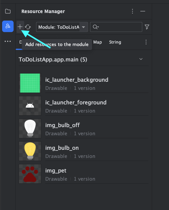
Press the + button to add an image from your computer.

Choose ‘Import Drawables‘

Select the image and click on Next.

Finally, click on Import.
Step 3: Add an Image to Jetpack Compose Function
Create a composable function ‘showImage()’
@Composable
fun showImage(){
   Image(
       painter = painterResource(id = R.drawable.call),
       contentDescription = "A call icon for calling"
       )
}
Inside your Composable function (showImage), utilize the ‘Image’ composable to integrate an image into your app’s user interface.
In the code above, R.drawable.call is a resource ID for the image downloaded from the internet.
In Android development, when utilizing the ‘Image’ composable in Jetpack Compose to insert an image, you have the option to set a property called ‘contentDescription.’ It is possible to set this property to null.
The contentDescription is a text description or label for the image that is used for accessibility purposes.
MainActivity.kt
import android.os.Bundle
import androidx.activity.ComponentActivity
import androidx.activity.compose.setContent
import androidx.compose.foundation.Image
import androidx.compose.foundation.layout.fillMaxSize
import androidx.compose.material3.MaterialTheme
import androidx.compose.material3.Surface
import androidx.compose.runtime.Composable
import androidx.compose.ui.Modifier
import androidx.compose.ui.res.painterResource
import androidx.compose.ui.tooling.preview.Preview
import com.bigknol.todolistapp.ui.theme.ExampleTheme

class MainActivity : ComponentActivity() {
    override fun onCreate(savedInstanceState: Bundle?) {
        super.onCreate(savedInstanceState)
        setContent {
            ExampleTheme {
                // A surface container using the 'background' color from the theme
                Surface(
                     modifier = Modifier.fillMaxSize(),
                    color = MaterialTheme.colorScheme.background
                ) {
                    showImage()
                }
            }
        }
    }
}

@Composable
fun showImage(){
    Image(
        painter = painterResource(id = R.drawable.call),
        contentDescription = "A call icon for calling"
    )
}


@Preview(showBackground = true, showSystemUi = true,)
@Composable
fun GreetingPreview() {
    ExampleTheme {
        showImage()
    }
}
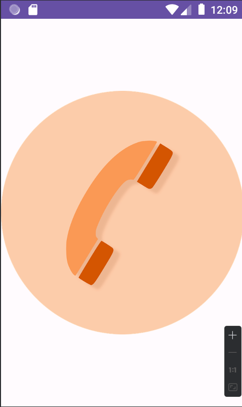
Step 4 : Run your app
Build and run your Android app, and you should see your image displayed within your Jetpack Compose UI.
[ Ctrl + R or Run Your app using Run button in Android Studio. ]
Step 5: Image in Jetpack Compose with Modifiers
@Composable
fun showImage(){
    Image(
        painter = painterResource(id = R.drawable.call),
        contentDescription = "A call icon for calling",
        modifier = Modifier.width(80.dp).height(80.dp)

    )
}
The combination of Modifier.width(80.dp).height(80.dp) ensures that the Composable is both 80dp wide and 80dp tall. This is commonly used to control the size of UI elements, making them a specific size or aspect ratio within the layout of your app.
The modifier is useful for adjusting the appearance and behavior of a user interface element, often referred to as a ‘Composable’
MainActivity
import android.os.Bundle
import androidx.activity.ComponentActivity
import androidx.activity.compose.setContent
import androidx.compose.foundation.Image
import androidx.compose.foundation.layout.height

import androidx.compose.foundation.layout.width

import androidx.compose.material3.MaterialTheme
import androidx.compose.material3.Surface
import androidx.compose.runtime.Composable
import androidx.compose.ui.Modifier
import androidx.compose.ui.res.painterResource
import androidx.compose.ui.tooling.preview.Preview
import androidx.compose.ui.unit.dp
import com.bigknol.todolistapp.ui.theme.ExampleTheme

class MainActivity : ComponentActivity() {
    override fun onCreate(savedInstanceState: Bundle?) {
        super.onCreate(savedInstanceState)
        setContent {
            ExampleTheme {
                // A surface container using the 'background' color from the theme
                Surface(

                    color = MaterialTheme.colorScheme.background
                ) {
                    showImage()
                }
            }
        }
    }
}

@Composable
fun showImage(){
    Image(
        painter = painterResource(id = R.drawable.call),
        contentDescription = "A call icon for calling",
        modifier = Modifier.width(80.dp).height(80.dp)

    )
}


@Preview(showBackground = true, showSystemUi = true,)
@Composable
fun GreetingPreview() {
    ExampleTheme {
        showImage()
    }
}
That’s it! You’ve successfully added an image to your app. Jetpack Compose makes it simple to create a visually appealing and interactive user interface.