
Modifiers in Jetpack Compose : Creating and Using Modifiers
In this Compose tutorial, we’ll show you what Jetpack Compose’s modifiers are and how they help change the way things look and behave in your UI elements. When you begin learning Jetpack Compose, you won’t want to overlook modifiers in Jetpack Compose. Let’s begin with modifiers.
An overview of Jetpack Compose modifiers
The basis for creating modifiers is the Modifier object. Modifier is a built-in part of Compose that holds settings you can use to change how things look and work in your UI. It has various methods to adjust things like borders, padding, background, size, and how things respond to events or gestures. After you define a Modifier, you can use it with other UI elements to make them look and behave differently.
Creating and Using Modifiers in Compose
Let’s create a Jetpack Compose starter project in Android Studio.
Create a composable function as below:
@Composable
fun Example_Screen(){
    Text(text = "Hello I ❤️ compose",
        fontSize = 30.sp,
        fontWeight = FontWeight.Bold
    )
}
MainActivity.kt
import android.os.Bundle
import androidx.activity.ComponentActivity
import androidx.activity.compose.setContent
import androidx.compose.foundation.layout.fillMaxSize
import androidx.compose.material3.MaterialTheme
import androidx.compose.material3.Surface
import androidx.compose.material3.Text
import androidx.compose.runtime.Composable
import androidx.compose.ui.Modifier
import androidx.compose.ui.text.font.FontWeight
import androidx.compose.ui.tooling.preview.Preview
import androidx.compose.ui.unit.sp
import com.bigknol.todolistapp.ui.theme.ExampleTheme

class MainActivity : ComponentActivity() {
    override fun onCreate(savedInstanceState: Bundle?) {
        super.onCreate(savedInstanceState)
        setContent {
            ExampleTheme {
                // A surface container using the 'background' color from the theme
                Surface(
                    modifier = Modifier.fillMaxSize(),
                    color = MaterialTheme.colorScheme.background
                ) {

                  Example_Screen()

                }
            }
        }
    }
}

@Composable
fun Example_Screen(){
    Text(text = "Hello I ❤️ compose",
        fontSize = 30.sp,
        fontWeight = FontWeight.Bold
    )
}


@Preview(showBackground = true, showSystemUi = true,)
@Composable
fun GreetingPreview() {
    ExampleTheme {

    }
}
Create a modifier in Compose
The initial step in learning to use modifiers is to create one, and it can be created without any configuration settings.
val modifier = ModifierA blank modifier will not give a satisfactory cool looking UI. It has no configuration settings. To configure the modifier, we have to call method on it. For example, if you want to add 20dp of padding on all four sides of any composable:
val modifier = Modifier.padding(all = 20.dp)
We can apply multiple configuration settings in a single operation like below:
val modifier = Modifier.padding(all = 20.dp)
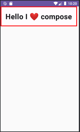
.border(width = 3.dp, color = Color.Red)Update Composable function Example_Screen()
@Composable
fun Example_Screen(){
    val modifier = Modifier
        .border(width = 3.dp, color = Color.Red)
        .padding(all = 20.dp)
    Text(text = "Hello I ❤️ compose",
        modifier = modifier,
        fontSize = 30.sp,
        fontWeight = FontWeight.Bold
    )
}
MainActivity.kt
import android.os.Bundle
import androidx.activity.ComponentActivity
import androidx.activity.compose.setContent
import androidx.compose.foundation.border
import androidx.compose.foundation.layout.padding
import androidx.compose.material3.MaterialTheme
import androidx.compose.material3.Surface
import androidx.compose.material3.Text
import androidx.compose.runtime.Composable
import androidx.compose.ui.Modifier
import androidx.compose.ui.graphics.Color
import androidx.compose.ui.text.font.FontWeight
import androidx.compose.ui.tooling.preview.Preview
import androidx.compose.ui.unit.dp
import androidx.compose.ui.unit.sp
import com.bigknol.todolistapp.ui.theme.ExampleTheme

class MainActivity : ComponentActivity() {
    override fun onCreate(savedInstanceState: Bundle?) {
        super.onCreate(savedInstanceState)
        setContent {
            ExampleTheme {
                // A surface container using the 'background' color from the theme
                Surface(

                    color = MaterialTheme.colorScheme.background
                ) {

                  Example_Screen()

                }
            }
        }
    }
}

@Composable
fun Example_Screen(){
    val modifier = Modifier
        .border(width = 3.dp, color = Color.Red)
        .padding(all = 20.dp)
    Text(text = "Hello I ❤️ compose",
        modifier = modifier,
        fontSize = 30.sp,
        fontWeight = FontWeight.Bold
    )
}


@Preview(showBackground = true, showSystemUi = true,)
@Composable
fun GreetingPreview() {
    ExampleTheme {

    }
}
Order of Applying Modifiers
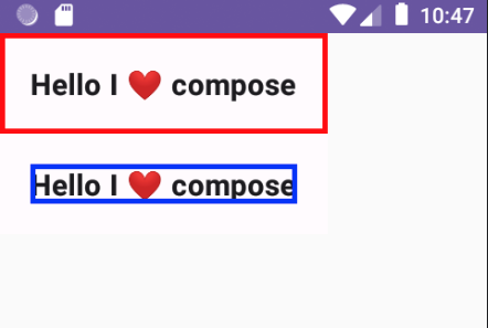
The sequence in which modifiers are linked holds considerable importance in determining the final output. In the previous illustration, the border was initially applied, and subsequently, the padding was added. As a result, the border is positioned outside the padding. To have the border contained within the padding, it is necessary to interchange the order of the modifiers as outlined below.
@Composable
fun Example_Screen2(){

    val modifier = Modifier
        .border(width = 3.dp, color = Color.Red)
        .padding(all = 20.dp)

    val modifier2 = Modifier
        .padding(all = 20.dp) // changed the order
        .border(width = 3.dp, color = Color.Blue)


    Column{
        Text(text = "Hello I ❤️ compose",
            modifier = modifier,
            fontSize = 19.sp,
            fontWeight = FontWeight.Bold,
        )
        Text(text = "Hello I ❤️ compose",
            modifier = modifier2,
            fontSize = 19.sp,
            fontWeight = FontWeight.Bold,
        )
    }

}
A Clickable Modifier Example
To make the text change color when it’s clicked, you can use the clickable modifier in combination with a remember state.
Create a new Kotlin file. (example_clickable.kt)
import androidx.compose.foundation.background
import androidx.compose.foundation.border
import androidx.compose.foundation.clickable
import androidx.compose.foundation.layout.fillMaxWidth
import androidx.compose.foundation.layout.heightIn
import androidx.compose.foundation.layout.padding
import androidx.compose.material3.Text
import androidx.compose.runtime.Composable
import androidx.compose.runtime.getValue
import androidx.compose.runtime.mutableStateOf
import androidx.compose.runtime.remember
import androidx.compose.runtime.setValue
import androidx.compose.ui.Modifier
import androidx.compose.ui.graphics.Color
import androidx.compose.ui.text.font.FontWeight
import androidx.compose.ui.unit.dp

@Composable
fun Example_TextContent(){

    var colorStatus by remember { mutableStateOf(Color.Black) }

    val modifier = Modifier
        .padding(all = 10.dp)
        .border(width = 2.dp, color = Color.DarkGray)
        .background(color = Color.LightGray)
        .fillMaxWidth().heightIn(min = 40.dp)
        .clickable {
         colorStatus = if(colorStatus == Color.Black) Color.Blue else Color.Black
        }

    Text(
        text = " Tap me to change color ",
        color = colorStatus,
        modifier = modifier,
        fontWeight = FontWeight.Bold
    )

}
MainActivity.kt
package com.bigknol.todolistapp
import android.os.Bundle
import androidx.activity.ComponentActivity
import androidx.activity.compose.setContent
import androidx.compose.material3.MaterialTheme
import androidx.compose.material3.Surface
import androidx.compose.runtime.Composable
import androidx.compose.ui.tooling.preview.Preview
import com.bigknol.allrunner.composables.modifiers.Example_TextContent
import com.bigknol.todolistapp.ui.theme.ExampleTheme

class MainActivity : ComponentActivity() {
    override fun onCreate(savedInstanceState: Bundle?) {
        super.onCreate(savedInstanceState)
        setContent {
            ExampleTheme {
                // A surface container using the 'background' color from the theme
                Surface(
                   // modifier = Modifier.fillMaxSize(),
                    color = MaterialTheme.colorScheme.background
                ) {

                    Example_TextContent()

                }
            }
        }
    }
}

@Preview(showBackground = true, showSystemUi = true,)
@Composable
fun GreetingPreview() {
    ExampleTheme {

    }
}

Most Common built-in Jetpack Compose Modifiers
background – Creates a solid-colored shape positioned behind the composable
clickable – Defines a callback function to execute when the composable is clicked, while also triggering a ripple effect upon clicking.
fillMaxHeight: Resizes the composable to occupy the maximum height allowed by its parent.
fillMaxSize: Resizes the composable to occupy the maximum height and width allowed by its parent.
fillMaxWidth: Resizes the composable to occupy the maximum width allowed by its parent.
offset: Moves the composable by a specified distance along both the x and y-axis.
padding: Adds space around a composable, with parameters for adjusting padding on all four sides or for specifying different padding values for each side.
rotate: Rotates the composable around its center point by a specified number of degrees.
scale: Adjusts the size of the composable by a specified scaling factor.
scrollable: Allows for scrolling within a composable that extends beyond the visible area of its containing layout.
layout – For implementing custom layout behavior.
size – Utilized to define the height and width of a composable. When no specific size is provided, the composable adapts its dimensions to accommodate its content.
Happy Composing!