12 Common Flutter Widgets with Practical Examples
In this lesson, you will learn how to practice the most common flutter widgets (basic flutter widgets). Most of the examples have screenshots of outputs for a better understanding of the widgets.

1. Text Widget
About this widget : The official doc says, “A run of text with a single style” learn more about Text widget
Text("Hello, Text")main.dart
import 'package:flutter/material.dart';
void main()
{
  runApp(TextExample());
}

class TextExample extends StatelessWidget
{
  @override
  Widget build(BuildContext context) {
    return MaterialApp(
      home: Scaffold(
        appBar: AppBar(title: Text("Text"),),
        body: Center(
            child: Text("Hello, Text"),
        ),
      ),
    );
  }
}
2. Placeholder
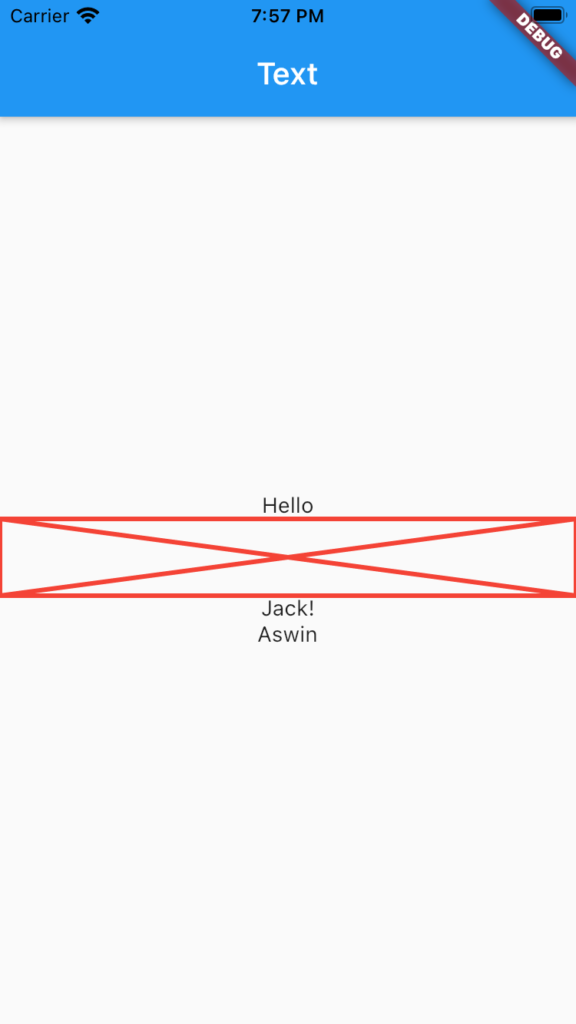
About this widget : The placeholder widget is one of the useful widgets. It helps to reserve a place for content. By default, the placeholder is sized to fit its container.
Placeholder(
  strokeWidth: 3,
  fallbackHeight: 50,
  color: Colors.red,
),
main.dart
import 'package:flutter/material.dart';
void main()
{
  runApp(PlaceHolderExample());
}

class PlaceHolderExample extends StatelessWidget
{
  @override
  Widget build(BuildContext context) {
    return MaterialApp(
      home: Scaffold(
        appBar: AppBar(title: Text("Text"),),
        body: Center(
          child:
            Column(
              mainAxisAlignment: MainAxisAlignment.center,
              children: [
                Text("Hello"),
                Placeholder(
                  strokeWidth: 3,
                  fallbackHeight: 50,
                  color: Colors.red,
                ),
                Text("Jack!"),
                Text("Aswin"),
              ],
            )
        ),
      ),
    );
  }
}
3. FlutterLogo
About the widget : Flutter logo widget creates a different variety of flutter logos.
FlutterLogo(
  size: 200,
  style: FlutterLogoStyle.horizontal,

)
main.dart
import 'package:flutter/material.dart';
void main()
{
  runApp(FlutterLogoExample());
}

class FlutterLogoExample extends StatelessWidget
{
  @override
  Widget build(BuildContext context) {
    return MaterialApp(
      home: Scaffold(
        appBar: AppBar(title: Text("Flutter Logo Example"),),
        body: Center(
            child: Column(
              children: [
                FlutterLogo(
                  size: 120,
                  style: FlutterLogoStyle.horizontal,

                ),

                FlutterLogo(
                  size: 120,
                  style: FlutterLogoStyle.markOnly,

                ),
                FlutterLogo(
                  size: 120,
                  style: FlutterLogoStyle.stacked,

                ),

              ],
            )
        ),
      ),
    );
  }
}
4. Icon
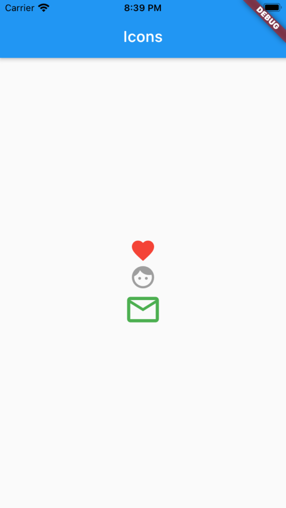
About the widget : Icon produces icons of different colours and sizes.
Icon(
  Icons.favorite,
  color: Colors.red,
  size: 15,
  semanticLabel: 'accessibility mode',
),
main.dart
import 'package:flutter/material.dart';
void main()
{
  runApp(IconExample());
}

class IconExample extends StatelessWidget
{
  @override
  Widget build(BuildContext context) {
    return MaterialApp(
      home: Scaffold(
        appBar: AppBar(title: Text("Icons"),),
        body: Center(
          child: Column(
            mainAxisAlignment: MainAxisAlignment.center,
            children: [
              Icon(
                Icons.favorite,
                color: Colors.red,
                size: 35,
                semanticLabel: 'accessibility mode',
              ),
              Icon(
                Icons.face,
                color: Colors.grey,
                size: 35,
                semanticLabel: 'accessibility mode',
              ),

              Icon(
                Icons.mail_outline,
                color: Colors.green,
                size: 50,
                semanticLabel: 'accessibility mode',
              ),

            ],

          ),
        ),
      ),
    );
  }
}
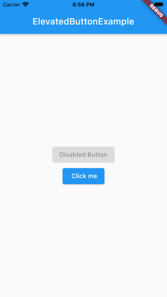
5. ElevatedButton
About this widget : It’s a replacement for deprecated RaisedButton in Flutter.
ElevatedButton(
    onPressed: () {
      // do some tasks
    },
    child: const Text(' Click me')),
main.dart
import 'package:flutter/material.dart';
void main()
{
  runApp(ElevatedButtonExample());
}

class ElevatedButtonExample extends StatelessWidget
{
  @override
  Widget build(BuildContext context) {
    return MaterialApp(
      home: Scaffold(
        appBar: AppBar(title: Text("ElevatedButtonExample"),),
        body: Center(
            child: Column(
              mainAxisAlignment: MainAxisAlignment.center,
              children: [
                ElevatedButton(
                    onPressed: null,
                    child: const Text('Disabled Button')),
                ElevatedButton(
                    onPressed: () {
                      // do some tasks
                    },
                    child: const Text(' Click me')),

              ],
            )
        ),
      ),
    );
  }
}
6. Container
About this widget : Container combines common painting, positioning, and sizing properties.
Container(
  width: 400,
  height: 200,
  color: Colors.red,
  margin: const EdgeInsets.all(10),)
main.dart
import 'package:flutter/material.dart';
void main()
{
  runApp(ContainerExample());
}

class ContainerExample extends StatelessWidget
{
  @override
  Widget build(BuildContext context) {
    return MaterialApp(
      home: Scaffold(
        appBar: AppBar(title: Text("Container"),),
        body: Center(
            child: Container(
              width: 400,
              height: 200,
              color: Colors.red,
              margin: const EdgeInsets.all(10),
              child: Text("Hello", textScaleFactor: 4,),
              padding: const EdgeInsets.all(40),
            )
        ),
      ),
    );
  }
}
7. Stack
About this widget : The Stack widget helps to overlap multiple children. You can place a photo over a boxed image using this widget.
Stack(
  alignment: Alignment.center,
  children: [
    Container(
      width: 300,
      height: 200,
      color: Colors.red,
    ),
    Container(
      width: 150,
      height: 100,
      color: Colors.green,
    ),)
main.dart
import 'package:flutter/material.dart';
void main()
{
  runApp(StackExample());
}

class StackExample extends StatelessWidget
{
  @override
  Widget build(BuildContext context) {
    return MaterialApp(
      home: Scaffold(
        appBar: AppBar(title: Text("Text"),),
        body: Center(
           child: Stack(
             alignment: Alignment.center,
             children: [
               Container(
                 width: 300,
                 height: 200,
                 color: Colors.red,
               ),
               Container(
                 width: 150,
                 height: 100,
                 color: Colors.green,
               ),
               Container(
                 width: 75,
                 height: 50,
                 color: Colors.amber,
               ),

             ],
           ),
        ),
      ),
    );
  }
}
8. Row
Learn more about Row
About this widget : Lays out a list of child widgets in the horizontal direction.
Row(
   children: [
     Text("One.. "),
     Text("Two.. "),
     Text("Three.."),
   ],
),
main.dart
import 'package:flutter/material.dart';
void main()
{
  runApp(RowExample1());
}

class RowExample1 extends StatelessWidget
{
  @override
  Widget build(BuildContext context) {
    return MaterialApp(
      home: Scaffold(
        appBar: AppBar(title: Text("Text"),),
        body: Row(
           children: [
             Text("One.. "),
             Text("Two.. "),
             Text("Three.."),
           ],
        ),
      ),
    );
  }
}
9 Column
Learn more about Column widget
About the widget : Lays out a list of children in the vertical direction.
 Column(
   children: [
     Text("One.. "),
     Text("Two.. "),
     Text("Three.."),
   ],
main.dart
import 'package:flutter/material.dart';
void main()
{
  runApp(ColumnExample1());
}

class ColumnExample1 extends StatelessWidget
{
  @override
  Widget build(BuildContext context) {
    return MaterialApp(
      home: Scaffold(
        appBar: AppBar(title: Text("Text"),),
        body: Column(
           children: [
             Text("One.. "),
             Text("Two.. "),
             Text("Three.."),
           ],
        ),
      ),
    );
  }
}
10. Center
About this widget : A widget that centres its child within itself.
Center(
  child: Column(
     children: [
       Text("One.. "),
       Text("Two.. "),
       Text("Three.."),
     ],
main.dart
import 'package:flutter/material.dart';
void main()
{
  runApp(CenterExample());
}

class CenterExample extends StatelessWidget
{
  @override
  Widget build(BuildContext context) {
    return MaterialApp(
      home: Scaffold(
        appBar: AppBar(title: Text("Text"),),
        body: Center(
          child: Column(
             children: [
               Text("One.. "),
               Text("Two.. "),
               Text("Three.."),
             ],
          ),
        ),
      ),
    );
  }
}
11. Image
Learn more about Image widget
12. Expanded
About the widget : The Expanded widget is one of the productive widgets that can accommodate child widgets in available space.
Expanded(
  child: Container(
    width: 100,
    height: 50,
    color: Colors.yellow,
    child: Text("YELLOW"),
  ),
),
Without Expanded widget

Let’s fix it.
import 'package:flutter/material.dart';
void main()
{
  runApp(ExpandedExample());
}

class ExpandedExample extends StatelessWidget
{
  @override
  Widget build(BuildContext context) {
    return MaterialApp(
      home: Scaffold(
        appBar: AppBar(title: Text("Text"),),
        body: Row(
          children: [
            Expanded(
              child: Container(
                width: 100,
                height: 50,
                color: Colors.red,
                child: Text("RED"),
              ),
            ),
            Expanded(
              child: Container(
                width: 100,
                height: 50,
                color: Colors.yellow,
                child: Text("YELLOW"),
              ),
            ),
            Expanded(
              child: Container(
                width: 100,
                height: 50,
                color: Colors.green,
                child: Text("GREEN"),
              ),
            ),
            Expanded(
              child: Container(
                width: 100,
                height: 50,
                color: Colors.grey,
                child: Text("GREY"),
              ),
            ),
          ],
        )
      ),
    );
  }
}