
TextField in Jetpack Compose : Basic and Material 3 API Fields
Jetpack Compose changed how we make Android apps, making it easier to create user interfaces. A crucial part of building interactive UIs is the TextField. This tutorial will show you how to use TextField in jetpack compose to make dynamic and user-friendly input fields. Let’s begin! If you are an absolute beginner, just start with simple Jetpack Compose app.
What is a TextField in Jetpack Compose?
A TextField is a fundamental UI element that allows users to input text. Whether you need to collect user names, search queries, or any other textual data, TextField is the way to go. With Jetpack Compose, you can easily customize the appearance and behavior of these input fields.
Step 1: Set Up Your Compose Project
Before we dive into TextField, make sure you have a Jetpack Compose project set up.
Step 2: Creating a Basic TextField
Here’s an example of a basic TextField:
@Composable
fun SimpleTextField()
{
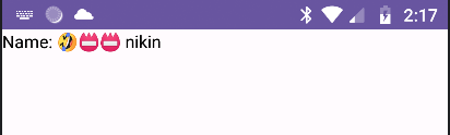
var text by remember {mutableStateOf("Name:")}
BasicTextField(
value = text,
onValueChange = {text = it}
)
}In this example, we define a BasicTextField with initial text, and we use the onValueChange callback to update the text as the user types.
MainActivity.kt
import android.os.Bundle
import androidx.activity.ComponentActivity
import androidx.activity.compose.setContent
import androidx.compose.foundation.layout.fillMaxSize
import androidx.compose.foundation.text.BasicTextField
import androidx.compose.material3.MaterialTheme
import androidx.compose.material3.Surface
import androidx.compose.runtime.Composable
import androidx.compose.runtime.getValue
import androidx.compose.runtime.mutableStateOf
import androidx.compose.runtime.remember
import androidx.compose.runtime.setValue
import androidx.compose.ui.Modifier
import androidx.compose.ui.tooling.preview.Preview
import com.bigknol.todolistapp.ui.theme.ExampleTheme

class MainActivity : ComponentActivity() {
    override fun onCreate(savedInstanceState: Bundle?) {
        super.onCreate(savedInstanceState)
        setContent {
            ExampleTheme {
                // A surface container using the 'background' color from the theme
                Surface(
                    modifier = Modifier.fillMaxSize(),
                    color = MaterialTheme.colorScheme.background
                ) {
                  SimpleTextField()

                }
            }
        }
    }
}


@Composable
fun SimpleTextField()
{
    var text by remember {mutableStateOf("Name:")}
    BasicTextField(
        value = text,
        onValueChange = {text = it}
    )
}


@Preview(showBackground = true, showSystemUi = true,)
@Composable
fun GreetingPreview() {
    ExampleTheme {
      SimpleTextField()
    }
}
Step 3: Customizing Your TextField
Jetpack Compose allows you to customize TextField to fit your app’s design. You can change its appearance, and text style.
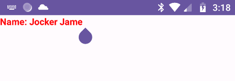
@Composable
fun SimpleTextField()
{
    var text by remember {mutableStateOf("Name:")}
    BasicTextField(
        value = text,
        onValueChange = {text = it},
        textStyle = TextStyle(color= Color.Red, fontWeight = FontWeight.Bold),
    )
}
Step 4: Handling Keyboard Actions with BasicTextField
You can also handle keyboard actions like “Done” or “Search” by modifying your TextField like this:
@Composable
fun SimpleTextField()
{
    var text by remember {mutableStateOf("")}
    BasicTextField(
        value = text,
        onValueChange = {text = it},
        textStyle = TextStyle(color= Color.Red, fontWeight = FontWeight.Bold),
        keyboardOptions = KeyboardOptions.Default.copy(
            imeAction = ImeAction.Done
        ),
        keyboardActions = KeyboardActions(
            onDone = {
                // Handle the 'done' action.

            }
        )
        {

        }

    )
}
Modern TextField in Jetpack Compose with Material 3 API
Let’s use the Material 3 API to create modern text fields. It’s an experimental feature. Take a look at the following UI to see how effective the new approach is.
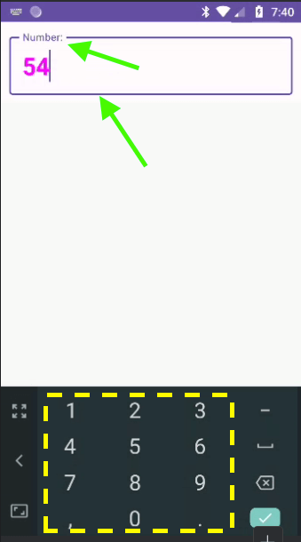
@OptIn(ExperimentalMaterial3Api::class)
@Composable
fun outLinedTextFieldDemo(){
    var text by remember { mutableStateOf("") }
   OutlinedTextField(value = text, onValueChange = {text = it},
       placeholder = {Text("Enter a number:")},
       modifier = Modifier
           .fillMaxWidth()
           .heightIn(min = 30.dp)
           .padding(10.dp),
       singleLine = true,
       label = {Text("Number:")},
       textStyle = TextStyle(
           fontWeight = FontWeight.Bold,
           color = Color.Magenta,
           fontSize = 28.sp),
       keyboardOptions = KeyboardOptions(keyboardType = KeyboardType.Number)
       )
}
placeholder
The placeholder parameter allows you to display a hint or placeholder text inside the OutlinedTextField. It provides users with guidance on what kind of input is expected. For example, you can set it to “Enter your name” to prompt users to enter their name.
singleLine
The singleLine parameter is a boolean value (true or false) that determines whether the OutlinedTextField should allow single-line or multi-line input. When set to true, the input is limited to a single line, which is useful for short text inputs like names or search queries. When set to false, it allows multi-line input, suitable for longer text entries, such as comments or descriptions.
label
The label parameter is used to provide a label or title for the OutlinedTextField. This label is typically displayed above the input field and helps users understand the purpose of the text input. It’s especially useful for form inputs where you want to describe what the user should enter.
textStyle
The textStyle parameter allows you to define the visual style of the text displayed within the OutlinedTextField. You can customize properties like the text color, font size, and font style to match your app’s design.
keyboardOptions
The keyboardOptions parameter lets you configure the behavior of the software keyboard that appears when the OutlinedTextField gains focus. You can set options such as the keyboard type (text, number, email, etc.)
MainActivity.kt
import android.os.Bundle
import androidx.activity.ComponentActivity
import androidx.activity.compose.setContent
import androidx.compose.foundation.layout.fillMaxWidth
import androidx.compose.foundation.layout.heightIn
import androidx.compose.foundation.layout.padding
import androidx.compose.foundation.text.KeyboardOptions
import androidx.compose.material3.ExperimentalMaterial3Api
import androidx.compose.material3.MaterialTheme
import androidx.compose.material3.OutlinedTextField
import androidx.compose.material3.Surface
import androidx.compose.material3.Text
import androidx.compose.runtime.Composable
import androidx.compose.runtime.getValue
import androidx.compose.runtime.mutableStateOf
import androidx.compose.runtime.remember
import androidx.compose.runtime.setValue
import androidx.compose.ui.Modifier
import androidx.compose.ui.graphics.Color
import androidx.compose.ui.text.TextStyle
import androidx.compose.ui.text.font.FontWeight
import androidx.compose.ui.text.input.KeyboardType
import androidx.compose.ui.tooling.preview.Preview
import androidx.compose.ui.unit.dp
import androidx.compose.ui.unit.sp
import com.bigknol.todolistapp.ui.theme.ExampleTheme

class MainActivity : ComponentActivity() {
    override fun onCreate(savedInstanceState: Bundle?) {
        super.onCreate(savedInstanceState)
        setContent {
            ExampleTheme {
                // A surface container using the 'background' color from the theme
                Surface(
                    //modifier = Modifier.fillMaxSize(),
                    color = MaterialTheme.colorScheme.background
                ) {

                 outLinedTextFieldDemo()

                }
            }
        }
    }
}

@OptIn(ExperimentalMaterial3Api::class)
@Composable
fun outLinedTextFieldDemo(){
    var text by remember { mutableStateOf("") }
   OutlinedTextField(value = text, onValueChange = {text = it},
       placeholder = {Text("Enter a number:")},
       modifier = Modifier
           .fillMaxWidth()
           .heightIn(min = 30.dp)
           .padding(10.dp),
       singleLine = true,
       label = {Text("Number:")},
       textStyle = TextStyle(
           fontWeight = FontWeight.Bold,
           color = Color.Magenta,
           fontSize = 28.sp),
       keyboardOptions = KeyboardOptions(keyboardType = KeyboardType.Number)
       )
}


@Preview(showBackground = true, showSystemUi = true,)
@Composable
fun GreetingPreview() {
    ExampleTheme {
        outLinedTextFieldDemo()
    }
}
How to validate?
To validate if the text entered in an OutlinedTextField is a number or not, you can use a combination of a validation function and keyboardOptions.
Let’s create a validation function:
fun String.isNumeric() : Boolean{
    return this.isNotEmpty() && this.all{it.isDigit()}
}
| Read more about Extension Functions in Kotlin |
Change the property as below:
onValueChange = { if(it.isNumeric() || it.isEmpty() ) {text = it}},MainActivity (Completed Version)
import android.os.Bundle
import androidx.activity.ComponentActivity
import androidx.activity.compose.setContent
import androidx.compose.foundation.layout.fillMaxWidth
import androidx.compose.foundation.layout.heightIn
import androidx.compose.foundation.layout.padding
import androidx.compose.foundation.text.KeyboardOptions
import androidx.compose.material3.ExperimentalMaterial3Api
import androidx.compose.material3.MaterialTheme
import androidx.compose.material3.OutlinedTextField
import androidx.compose.material3.Surface
import androidx.compose.material3.Text
import androidx.compose.runtime.Composable
import androidx.compose.runtime.getValue
import androidx.compose.runtime.mutableStateOf
import androidx.compose.runtime.remember
import androidx.compose.runtime.setValue
import androidx.compose.ui.Modifier
import androidx.compose.ui.graphics.Color
import androidx.compose.ui.text.TextStyle
import androidx.compose.ui.text.font.FontWeight
import androidx.compose.ui.text.input.KeyboardType
import androidx.compose.ui.tooling.preview.Preview
import androidx.compose.ui.unit.dp
import androidx.compose.ui.unit.sp
import com.bigknol.todolistapp.ui.theme.ExampleTheme

class MainActivity : ComponentActivity() {
    override fun onCreate(savedInstanceState: Bundle?) {
        super.onCreate(savedInstanceState)
        setContent {
            ExampleTheme {
                // A surface container using the 'background' color from the theme
                Surface(
                    //modifier = Modifier.fillMaxSize(),
                    color = MaterialTheme.colorScheme.background
                ) {

                 outLinedTextFieldDemo()

                }
            }
        }
    }
}

@OptIn(ExperimentalMaterial3Api::class)
@Composable
fun outLinedTextFieldDemo(){
    var text by remember { mutableStateOf("") }
   OutlinedTextField(value = text,
       onValueChange = { if(it.isNumeric() || it.isEmpty() ) {text = it}},
       placeholder = {Text("Enter a number:")},
       modifier = Modifier
           .fillMaxWidth()
           .heightIn(min = 30.dp)
           .padding(10.dp),
       singleLine = true,
       label = {Text("Number:")},
       textStyle = TextStyle(
           fontWeight = FontWeight.Bold,
           color = Color.Magenta,
           fontSize = 28.sp),
       keyboardOptions = KeyboardOptions(keyboardType = KeyboardType.Number)
       )
}

fun String.isNumeric() : Boolean{
    return this.isNotEmpty() && this.all{it.isDigit()}
}


@Preview(showBackground = true, showSystemUi = true,)
@Composable
fun GreetingPreview() {
    ExampleTheme {
        outLinedTextFieldDemo()
    }
}
Happy Coding!